‘I think Bigfoot is blurry, that’s the problem. It’s not the photographer’s fault. Bigfoot is blurry, and that’s extra scary to me. There’s a large, out-of-focus monster roaming the countryside. Run! He’s fuzzy, get out of here!’
– Mitch Hedberg “Just For Laughs: On The Edge”. 2002
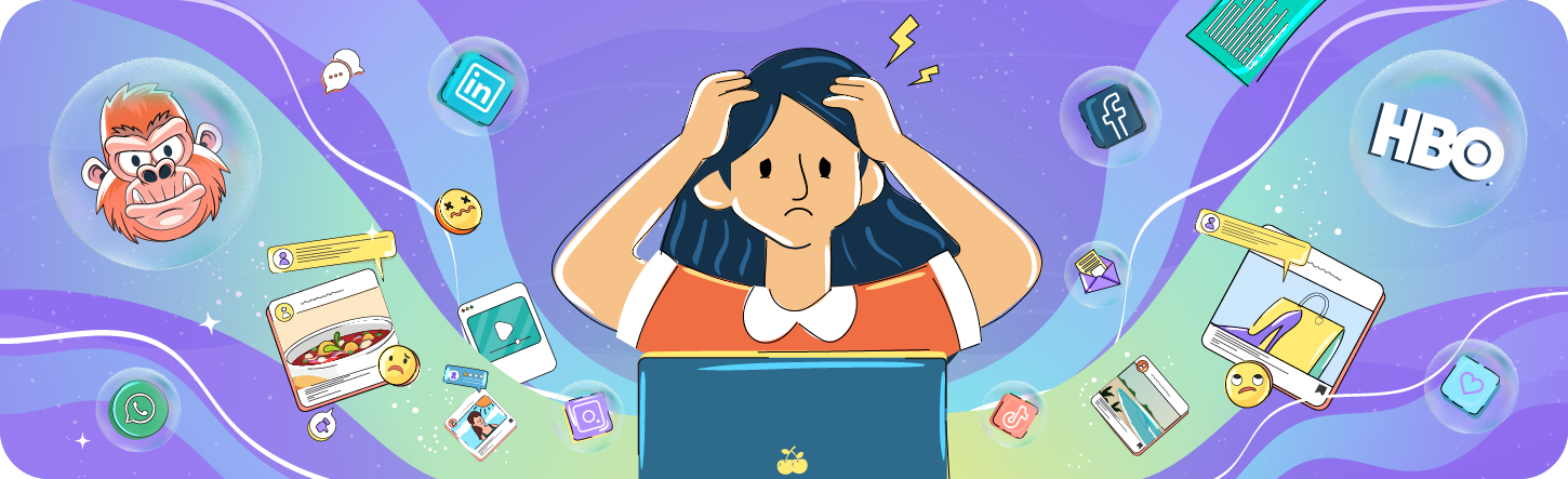
If you are a marketer – more relatable words haven’t been uttered. The tireless scrolling, the random ideas, the multiple “open tabs” both on your computer and your brain – You are aware that there is a monster lurking close by – but it’s blurry, so does it exist?

Between these thoughts exists “your brand”. Do you need to market more? Is there a way to sit in your customers’ living room and tell them “we are all you’ve ever wanted”? When does it all get too much?
All these questions feel personal, don’t they? Whether you are responsible for marketing an established brand or working on getting the right attention for an SME, there is a fine line between selling your brand and taking it into overdrive.

- You could be over advertising your product/service.
- You could be doing one too many rebrands.
- You could be sending the wrong message.
- You could be doing way too much!
The outcome? Your target audience is overwhelmed!
GWI Report – Connecting the Dots 2023: The Trends Defining Global Consumer Behavior
(GWI, 2023) observed:
“Consumers are overwhelmed by the sheer volume of branded content. Brand fatigue is setting in, pushing people to tune out or actively avoid marketing.”
Overwhelmed consumers, overspent budgets and overworked marketers do not a winning campaign make – Not to sound too dramatic but over sharing the brand message, constantly rebranding your business or over extending the product line is probably going to get really annoying after a while.
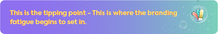
What is Branding Fatigue, You Ask?
Brand fatigue happens when people lose interest in your brand – either from seeing it too much, hearing the same message repeatedly, or feeling it no longer reflects what they expect. It often begins with subtle signs like declining engagement or sales, but if ignored, it can erode your brand identity completely.
This is especially risky in B2C markets, where attention spans are short, options are endless, and loyalty is low. Here, brand fatigue isn’t just a marketing issue; it’s a business threat.
Common causes include:
- Repeating the same message across all channels.
- Failing to evolve or update the brand.
- Rebranding too frequently, leading to confusion and mistrust.
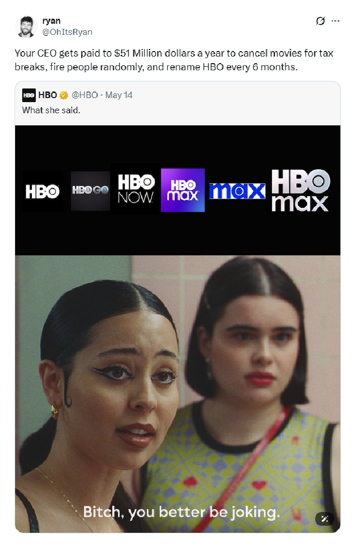
“It lasted all of three years & the consumers were more confused than HBOs own branding experts”
Here’s the timeline that led to the Branding Fatigue of the Decade:

Before we get to the Memes and the trolling we must understand what the entire mess was about. To put things into perspective, here’s what happened.
The Problem: Self-Inflicted Brand Identity Crisis
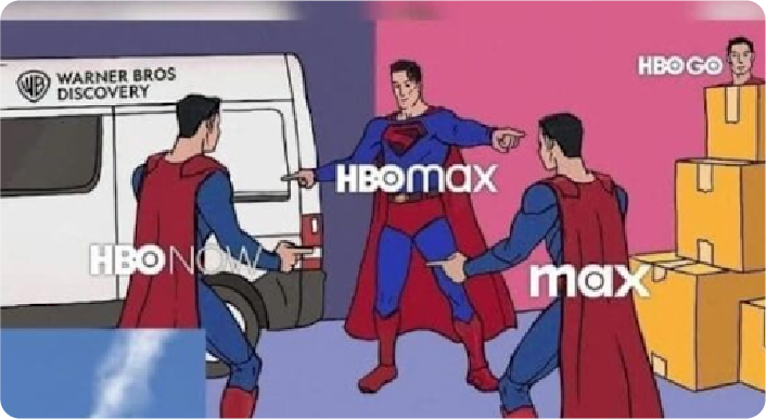
When Warner Bros. Discovery dropped the “HBO” from HBO Max in 2023, they claimed the move would create a more “inclusive” platform identity, one not limited to HBO’s premium legacy. However, audiences didn’t buy it – and the name Max lacked the cachet and credibility that “HBO” carried for decades.
Within months, it became clear: the new name diluted the brand. It was generic, forgettable, and evoked nothing of the prestige content HBO is known for. The decision quickly became a textbook case of branding fatigue; consumers were confused, irritated, and exhausted by the constant identity reshuffling.
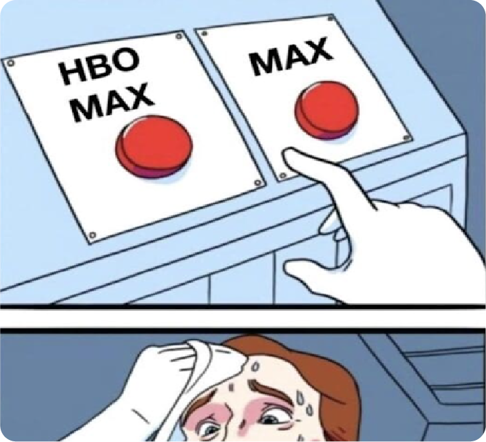
Then Came the Memes & Mockery
Social media didn’t hold back. The HBO Max memes that followed were relentless:
- “Corporate Flip-Flop” Memes compared execs to indecisive politicians or toddlers picking a new favorite color every five minutes.
- “Meeting Room Mayhem” Memes imagined rooms full of overpaid consultants arriving at the revolutionary idea to… revert to the original name.
- “Ctrl+Z Culture” Memes depicted the company desperately hitting “undo” after realizing they’d fixed what wasn’t broken.
This organic wave of user-generated content not only amplified the blunder; it defined the brand conversation.
These are just a few of the memes that took over the social feeds of streamers worldwide. While the buzz may have been real, continuous branding revamps have left the brand a laughing stock, especially among newer audiences.

While the brand revamps may be in the making since 2008 , the accessibility today gives the audiences platforms to let out their frustrations.
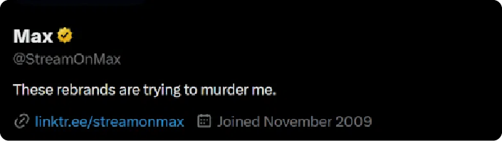
One user posted:
Before we get into what came after the naming-renaming and then some; there were a few lessons to be learnt.
You can’t fix what you can’t see – Before jumping into a shelling out more branding content or even going for a rebrand, understand that
- Branding Fatigue is Costly.
- Your Brand Messaging Can Quickly Turn into Marketing Fatigue This Time Round. But You Can Identify the Warning Signs!
How?
Without understanding that you might be over marketing your presence by either rebranding your brand, shelling out more ads or posting on every imaginable platform – you may end up in a loop that costs more than it can pay back.
The Warning Signs you Keep an Eye Out for?
- Engagement’s Gone Cold If likes, shares, or comments are dipping, your audience may be tuning out. It’s not always bad content – it could be a tired brand message.
- The Vibe Feels Off Use surveys, polls, or tools like Brandwatch to check customer sentiment. You see a shift toward neutral or negative feedback? That’s a red flag.
- Ghosted on Social If followers are skipping, muting, or just not reacting, your brand voice may be wearing thin.
- Loyalty is Slipping A drop in repeat purchases or NPS? That means your biggest fans might be slowly walking away.
- Your Numbers Don’t Lie High bounce rates, low conversions, or ad fatigue point to a message that’s no longer landing.
Repetition works; but overdo it, and you risk brand fatigue. When customers feel overwhelmed by constant, repetitive messaging, they disengage. Nearly half of users have unfollowed brands for too many promos.
Here’s how to stay visible without wearing out your welcome:
- Track & Tweak Regularly Declining engagement mid-campaign? It’s time to reassess. Monitor performance and A/B test frequently to find the right message cadence and channel mix.
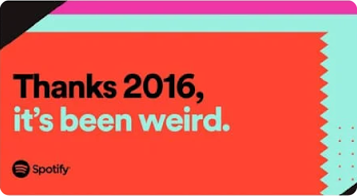
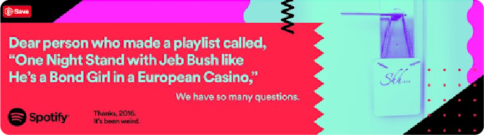
- Know Your Audience Build around 3–5 key personas. Tailor messaging to resonate, just like Spotify’s “Thanks 2016” campaign; relevant, fun, and hyper-personalized.
- Customize by Channel Avoid copy-paste content. Adapt your message to fit the tone and style of each platform, like Adobe does across Instagram, Facebook, and Twitter.
- Refresh Ad Creative Often Stale ads kill performance. Rotate creatives every 1–2 weeks to maintain engagement and improve ROI.
- Allign Promotions to Strategy Map your campaigns to clear marketing objectives. A smart schedule tied to KPIs keeps efforts focused and impactful.
With the right strategy, customised content, the right visuals & an understanding of the digital space can create a branding message that resonates with the audience without exhausting the message.
They embraced the fatigue!
From the regional handles to their Instagram pages, HBO leaned into the “buzz” that their branding misstep created.
They referenced the Lotus season 2, posted Maddie Perez from Euphoria and uploaded a short video with an UNO reverse card – showing the world they were owning up to the branding fatigue!
And Now… For the Marketers: Buckle Up!
- The Narrative Was OWNED! They made it personal. They connected with the audience rather than censoring the feedback they joined in. This not only reiterated that the audience was being heard but also made sure that they felt like they were part of the process!
- The Self Awareness in the Humor Was the “IT” Move! The meanest remarks, the funniest memes & even the negative reactions turned into engagement! The brand showed that they are just as “human” as their viewer and that’s what clicked!
- A Legacy Was Maintained! You don’t mess with a “legacy name” even if you have a multi-brand portfolio! Instead you make it relatable. A brand as tenured as HBO meets the world of UGC, Meme-marketing & social media – all to its advantage!

Listen to your audience, respect your roots, never underestimate the power of a well-timed joke.
Oh and get a CaaS team like IRIS on board as soon as you can!